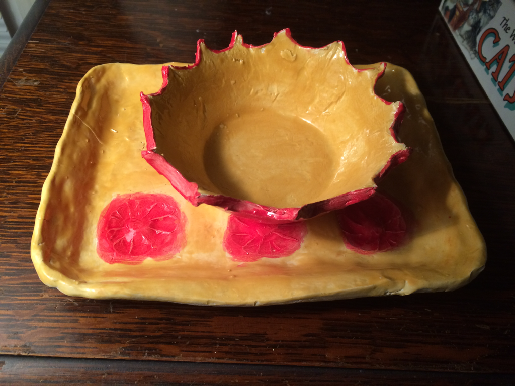
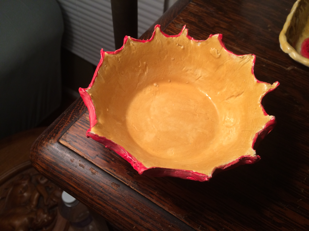
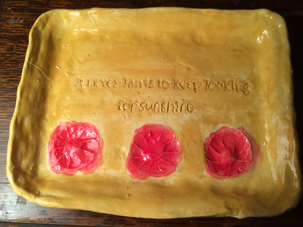
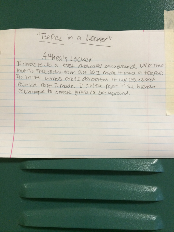
I chose to do the clay bowl and tray because I wanted to make a Christmas present for my mom. She had been wanting me to make her some pottery because she loves it so she was very happy with my project. The quote on my tray is a pooh bear quote and was also my baby theme for my room so it has a sentimental value to my mother and I.
I really liked that this piece was a print make! It's so elaborate and the details are so good for a print make. When I did a print make it was hard. This person did a whole portrait out of a print make and captured all the details of the face. I think this piece is very unique and detailed.
Piece by Lizzie Davis Art criticism process:
I would critique my work by looking at the shading and blending. I would also look at how I captured the face and the details of the face.
I chose to do my dad for my portrait because I wanted to draw his beard. His beard has a lot of colors in it and I wanted to try and blend them together. I chose to work with oil pastels because I think they blend really well and I could get a nice texture with them. For our collage, we chose to do a vintage theme. We added a lot of lace and cut out words from the magazines to layer over tissue paper. I liked doing this project because I liked doing collages. Our thought process was we gathered pieces we both liked and talked about where we think they could go and how they could go together. I liked working on this with the AP class and I think I would like to do something like this again.
I chose to paint a band symbol from the band The Grateful Dead. I was named after one of their songs and not many people know that about me. I found it difficult to draw and paint the skull. I was stumped on what to do with the background also. I think the skull was the most successful thing about this piece. I think the skin color warm up was the most helpful because skin color is very hard to paint.
I looked on Pinterest and Google for different printmaking designs and I really liked the wave design. When I decided I wanted to do something with waves, I chose to do a North Carolina themed piece with mountains, hills, and waves.
The difficulties in this piece were the waves. They were small and curvy and hard to keep a straight hand on. If I were to re-do this project I would change how things were laied out. I wouldn't put so much curvy aspects in the piece so it would be easier to cut out and would turn out better. For my locker project, I originally wanted to do a flower theme with a tree but the tree ended up being a teepee. My theme turned out to be "teepee in a locker". I was inspired by these paper flowers I saw on Pinterest and wanted to incorporate them into the locker and I had the idea for them to hang from a tree but it didn't work out. When I started to make the tree, I realized it started to look like a teepee so that's what it ended up to be.
I think it was hard working in a small space because I had to get my hand behind the teepee to glue leaves on and I had to adjust the size of the teepee. I used plaster strips and wire to make the teepee and used paint to paint the forest background. I also used to paper in a blender technique to create the forest floor. My mentor's name is Kailey P. We talked about what mediums we liked to use best and our favorite pieces we have made. We talked about what classes we are taking and about school. Her URL is www.kaileyp.weebly.com. I found that we had the same favorite medium and that's interesting.
This is my eye ink piece and I used the calligraphy pen and sharpie to draw the eye. It was hard the first time but after practice I got the hang of it. I have done this drawing before and decided I wanted to do it again but in ink. It's very similar to the original drawing but it has more emphasis on the lines now that it's in ink. I think I have a range of values because her shirt and face our different thicknesses of pen. I drew her face and then worked on the hair which was much harder in pen. Zentangle! I found this project so relaxing. All the little details just made you focus and it helped block everything out. I think "zen" matches this style because it's very relaxed in the way of the flower and has all these awesome details to make it look cool. I started out with a flower and then started from each flower petal tip and went to the inside of the flower. So I started from the outside and went in with elaborate designs.
I was inspired by the journal section (http://www.pinterest.com/artofapex/journal-pages/)on this website which led me to a Pinterest board with all these cool designs. I chose to do a flower design because I felt I could add a lot of detail into the flowers. I knew I wanted to try painting because I wanted to become better at it. I ended up really loving to use acrylic paint. My piece is similar to my inspiration in the way of the design and how it was created but it's my own because of the colors and patterns I used. The thing that's most successful about my peice is the balance of color and the balance of design. One section doesn't outdo any other section. In a future piece, I would add more background detail.
|
AuthorWrite something about yourself. No need to be fancy, just an overview. ArchivesCategories |